How many times have you spent way too long tweaking font sizes, line heights, and letter spacing just to make a hero section feel right? We lost count of the late-night Figma sessions where we swapped fonts three times before realizing we were back at the starting point. Ridiculous, but one wrong choice and suddenly your clean, modern layout looks like a 2004 page.
Contents:
Yes, fonts still matter. Everything can look solid; however, for example, that ultra-thin sans-serif you’ve picked because it’s popular ruins readability and brand perception. Another night of scrolling through all the fonts awaits you until it gets right.
But then, how do you even pick something that looks good and performs well and still feels human? Especially when your dev team side-eyes every custom font you suggest because of load times?
We’ve got your back and put together this list. These are not just the best fonts for web design. They have been actually tested by the Shakuro team in real projects. How they behave under stress, how they pair with common UI patterns, etc. Some are bold, some are quiet workhorses, but they all make your job easier without sacrificing style.
Anyway, if you’re tired of guessing or just looking for modern web fonts to try in your next prototype, stick around.
Best Fonts for Web Design: Short Answer
The best web fonts are readable, flexible, fast to load, and suitable for the product’s tone. For most websites and digital products, Inter, Geist, Manrope, TT Norms Pro, DM Sans, Satoshi, and JetBrains Mono are strong choices. Use display fonts only for headlines, keep body text simple, and always test fonts on real devices before launch.
Why Typography Still Defines Web Design in 2026
Beginners often pay attention to the layout rather than fonts and slap on something default regardless of factors like brand, target audience, industry, etc. However, the text’s shape has an impact on how people interact with the product. It can even make the website hard to use.
Impact on Branding & Identity
When every startup from Berlin to Bangalore picks the same safe font, your brand starts blending into the background. Like showing up to a party in a gray hoodie. But if you know the latest web typography trends, you get the sleekest outfit and can easily become the highlight of that party.
The typeface carries tone, personality, and even values. If Netflix used Comic Sans, would you trust it? If Apple switched to a chunky retro pixel font, would it still feel premium? Probably not.
So even small studios are tweaking x-heights or adjusting letter-spacing curves to make their UI feel unique. You see, custom typefaces are no longer just for giants like Google. Foundries are offering more modular licensing, and tools like Glyphs or FontForge make lightweight customizations way more accessible.
Plus, with variable fonts for web, you can have one font file that behaves differently across all touchpoints: bolder on desktop, airier on mobile, and condensed in navigation. That flexibility means your voice stays consistent regardless of the device or format.
Influence on UX & Readability
You can have the thoughtful user journey, perfect information architecture, and killer onboarding flow, but if your text is difficult to read, none of it matters. People aren’t going to struggle through 300 words of light-gray Roboto Thin on a white background just to figure out what you do. They will just turn to the competitor.
Readability is a must, no questions. Mobile-first everything, dark modes everywhere, and users accessing sites in all kinds of lighting—you just have to adapt.
For instance, one of the main issues we see here and there. Contrast. So many designs where a designer picked a cool, muted gray for body text because it “feels modern.” Well, it’s cool and modern until someone with mild vision issues or an older phone screen can’t make it out. All that modern style crumbles when it comes to WCAG AA compliance.
By the way, a wisely picked typography creates a visual flow that guides the user. With a big heading, clear subheads, and paragraphs with breathing room, you signpost. You tell users where they are, what’s important, and how to move forward.
Performance & Technical Considerations
Something that looks amazing in Figma can take precious seconds to render on mid-range smartphones. And users usually wait around 1 to 3 seconds until they give up.
The file size matters less than it used to, but it still matters because not all fonts in web design are optimized equally. For example, some trendy display fonts have a file size of 80–100KB for each weight in a single style. Multiply that by four weights, and it’s half a meg just for type.
Looks ok, but it gets wild quickly when you consider that many users are still on spotty connections, like in rural areas or crowded networks. In this case, variable fonts can redeem the situation. Instead of loading five separate files for light, regular, etc., you load one file that does it all.
Landing Page for AI Video Production Platform by Shakuro
TT Norms Pro: A Flexible Choice for Modern Design Systems
Finally, time to discuss the best fonts for web design. Starting with the highlight of this article—an option we often go for ourselves—TT Norms Pro. No joke, we are using this font on our website.
Why Designers Choose It
It’s versatile, with a balanced humanist touch, so it feels neutral without being cold. The font works well in a dashboard, as a body text at 14px on mobile, and as a bold headline on a landing page. In all these cases, TT Norms Pro is legible and eye-catching.
Performance-wise, it’s pretty lean. Especially if you subset it or serve only the weights you actually use. For instance, you can bundle regular, medium, and bold. That’s usually enough for most components. And it keeps the total font payload under 30KB. Remember those precious seconds we’ve mentioned before? Yeah, the loading will be pretty fast with these sizes.
Sometimes we have to leverage several fonts. So what about pairing TT Norms Pro with a serif for editorial pages or a monospace for code snippets? Well, it plays nice with modern web fonts without fighting for the users’ attention.
TT Norms Pro has excellent hinting, renders well across devices, and includes a full set of weights and true italics. That matters for readability, especially in longer UI strings or error messages where tone can shift.
Now, let’s sum up all the advantages:
✅ Clean, neutral vibe: A humanist touch without feeling robotic. With subtle curves and open shapes, it doesn’t read as cold or overly corporate. Great for interfaces that want to feel professional and slightly approachable.
✅ Excellent legibility at small sizes: It holds up well even at 12–14 px. Perfect for dashboards, tables, forms, or any place where space is tight but clarity is a must.
✅ Full range of weights: From Thin to Black, with proper italics across the board. That kind of variety gives you real typographic hierarchy without needing a second font.
✅ True italics, not obliques: Huge for readability and tone. Makes a difference in longer text blocks or emphasized UI messages.
✅ Strong language support: TT Norms Pro covers Latin-based languages, including Central/Eastern European characters. Less risk of fallback fonts breaking your design.
✅ Great for both UI and editorial content: Works just as well in buttons and labels as it does in blog posts or help docs. Reduces visual noise in your system.
✅ Super consistent letterforms: Letters like ‘I’, ‘l’, and ‘1’ are easy to tell apart. No squinting. Also helps avoid user confusion, that’s super important in data-heavy apps.
✅ Optically balanced numerals: Has both proportional and tabular figures. That’s perfect alignment in pricing tables, stats, or forms.
✅ Performs well on screen: Well-hinted and optimized for web rendering. Minimal fringes or blurriness, even on lower-DPI screens.
✅ Lightweight when subsetted: You’re not stuck loading all 9 weights. Use only what you need, and it stays lean.
✅ Pairs easily with other typefaces: Plays nice with serifs (like PT Serif), display fonts, or monospaces (JetBrains Mono, for instance). Flexible in modular design systems.
Real-World Use Cases
TT Norms Pro is considered to be one of the best fonts for UI design not just by chance, without firm proof.
First of all, businesses from various industries utilize this font for branding and web design, including technology, e-commerce, media, and lifestyle. ASUS, AliExpress, CBSN, DreamWorks, Doordash, and Intercom have made TT Norms Pro their corporate typeface.
AliExpress specifically used it as the branding font for their marketplace. It’s an online retail service from China that sells different products online and ships them worldwide.
A customized version of TT Norms Pro is used on the Crocs website. Developed specifically for this famous American casual footwear brand, it reflects comfort and self-expression—the main qualities of the company’s products.
ASUS also included this font in its branding identity. The international electronics manufacturer strives to build innovative technologies and make them easy to access. TT Norms Pro helps ASUS look professional and more approachable.
An American film studio, DreamWorks, implemented the font on their website too. Yeah, the company that has created well-known animations and short films also relies on TT Norms Pro to deliver its message.
And yeah, we use TT Norms Pro on our website too. It makes Shakuro look easy to approach but still professional and well-equipped, with all the texts being legible regardless of the device.
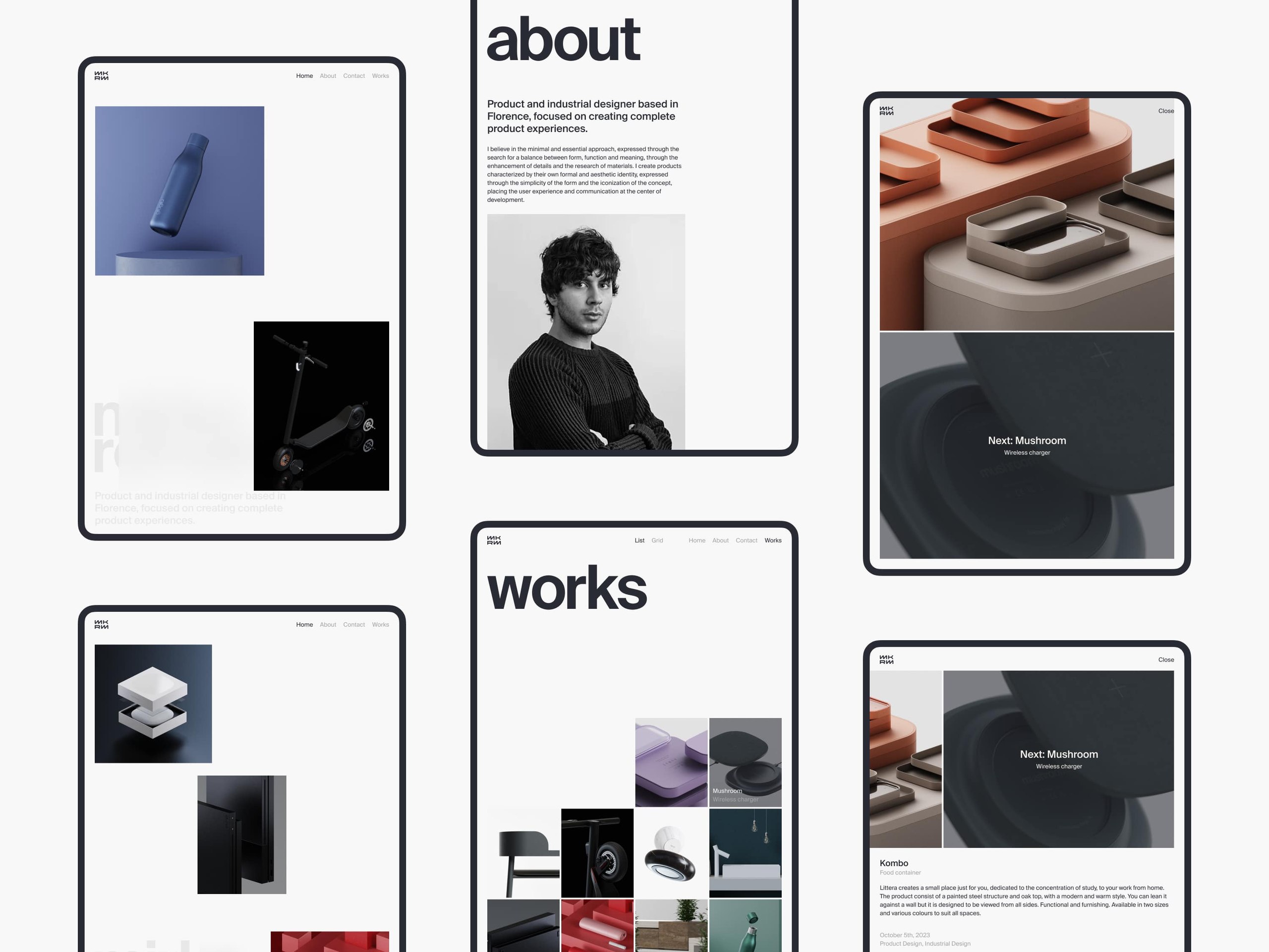
TT Norms Pro in Symbolik elements by Shakuro
Practical Font Picks Designers Actually Use
Apart from TT Norms Pro, there are others our designer team uses depending on the case. These are the go-to options, both free and paid, that work well for many projects of different types and industries. They please the eyes and make the text readable. Perhaps, you will find some new fonts to check out.
Inter & Geist—The Basics
Built specifically for legibility on screens, Inter is crisp, neutral, and slightly warm for a grotesk. Tall x-height, generous counters, clean cuts. It is one of the best fonts for readability because it works well both on a retina display and on a cracked phone screen at noon in July. It’s practically free (with a super permissive license), loads fast, and looks good in different conditions.
These features have made the font the default go-to for early-stage work. When you’re sketching out flows and no one’s decided on a brand voice yet, Inter is your safe harbor. Quite often, you start with Inter “just to get moving,” and six months later, it is still there because the font is good enough.
At first glance, Geist from the folks at Vercel feels familiar, almost like someone took Inter and gave it a light polish. But deeper you notice slight differences: slightly rounder curves, friendlier apertures on letters like ‘c’ and ‘e,’ and a touch more space between characters. It feels a bit softer, a bit more modern.
Geist is free for commercial use, optimized for UI, and you can install it via npm as a dependency. That means it integrates seamlessly into React apps, Next.js projects, or whatever. No fiddling with CSS imports or worrying about FOIT.
Like Inter, it scales well and looks sharp at small sizes, holds up in dense tables, and comes in a full family (including mono). That’s why it is one of the best fonts for UI design.
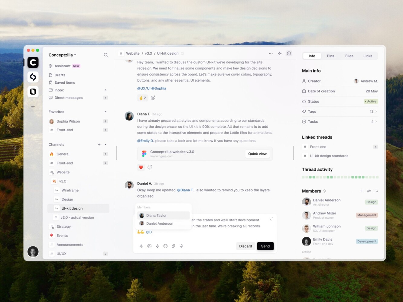
Geist in SaaS communication web app by Conceptzilla
Manrope & Host Grotesk—Balanced and Clean
Manrope started as a free, open-source project and was designed specifically for screen readability, with a focus on UI use cases.
Thanks to this focus, it deals gracefully with the numerals. Yeah, “straight” or “lining” figures—all digits sit on the baseline, same height, perfectly aligned. Ever tried to line up numbers in a pricing table or stats dashboard and seen the ‘3’ and ‘5’ dip below the others? A real pain, and Manrope fixes it.
If we take first impressions, the font sits between Inter and Interpolation (its spiritual successor).
It’s free and available on Google Fonts, with no licensing headaches.
There are some downsides, though. Manrope doesn’t have the widest range of weights or true italics in every weight. If you need strong typographic contrast, you might hit limits.
Host Grotesk has got that expressive-but-controlled vibe. Feels familiar at first glance: clean grotesque structure, tight curves, slightly condensed proportions. But with a character. The ‘t’ has a subtle flare, the ‘a’ and ‘e’ open wide, and the terminals feel just a bit more deliberate than your average system font.
It scales and works at small sizes without losing legibility, and the heavier weights pack a punch in headers without dominating the layout. Plus, the family includes multiple widths and optical sizes, so you can fine-tune it for headlines vs. body text.
Unlike some overly geometric fonts in web design that start to blur together after a few paragraphs, Host Grotesk keeps its shape, both literally and figuratively.
Mona Sans & Hubot Sans—GitHub’s Contribution to Web UI
Mona Sans is GitHub’s own typeface, released in 2023 alongside their rebrand. It’s a humanist sans with just enough character to avoid feeling sterile. The letterforms are open, the spacing is generous, and it handles small sizes really well. This matters when someone’s squinting at a nested error log at 2 a.m.
Being open-source and hosted via npm, it integrates smoothly into React-based UIs or design systems already using Primer (GitHub’s design language). There is no license stress and no slow third-party font loads. So, if you need a simple utility interface, in this case it is one of the best fonts for web design.
Hubot Sans is technically the same core family as Mona Sans but tweaked to feel more playful and slightly quirky. With wider apertures, softer curves, and slightly taller x-height, it is still totally usable in UI.
Letters like ‘g’ and ‘a’ have a friendlier double-story shape, and the ‘t’ has this subtle notch that gives it a bit of charm without breaking rhythm. We’ve seen it in internal admin panels and startup dashboards where the team wanted something clean but didn’t want to default to Inter again. Works great for headings, empty states, or any place where you want a touch of warmth.
Both Mona Sans and Hubot Sans deliver that much-needed clarity, reliability, and readability for product panels, internal tools, or B2B SaaS apps. Since they’re optimized for screen rendering and come with variable font support, they’re light, fast, and adapt well across devices.
DM Sans, Switzer & Urbanist—Modern Open-Source Options
DM Sans comes from Google’s Domaine family. Slightly rounded corners, open apertures, generous spacing. Makes it super readable at small sizes, which is why we keep seeing it in mobile apps, onboarding flows, and UI copy where clarity matters more than style.
It works equally well in body text and headings. A lot of sans-serifs either shine in display sizes or vanish in paragraphs, but DM Sans holds up everywhere. Plus, it’s free via Google Fonts. And with variable font support now live, you can tweak weight smoothly without loading multiple files.
Switzer is a new player in town, and it’s already becoming a favorite among designers who want neutrality without blandness.
Cleaner than Helvetica, more refined than Inter, but still totally unobtrusive. The letterforms are tight, the proportions balanced, and the contrast is low enough to feel stable across weights. It reads fast, which makes it perfect for dashboards, news apps, or any interface where people are skimming.
The creators definitely followed the web typography trends, so they optimized the font for UI. The numerals are crisp, the punctuation is clear, and the italics actually feel like emphasis. There is a monospace version for dev tools or data-heavy products.
There is a fly in the ointment, though—it’s not free.
Urbanist is a sleek, lightweight sans that feels like what would happen if Figma and iOS had a typography baby.
It’s ultra-clean, almost architectural. Low contrast, neutral shapes, minimal stroke variation. Very much in the neo-grotesque family, but with a modern polish. It feels at home in minimalist product interfaces, smart home apps, or anything going for that “calm tech” vibe.
Lightness is one of its main features, both visually and in file size. The regular and light weights are airy, so the font works great in mobile-first designs where you want breathing room.
Urbanist is not free, but the prices aren’t crazy. You can get it through major font platforms (like Typotheque and Adobe Fonts).
Clash Display, Sora & Satoshi—Character and Style
Clash Display is a display font, so you’re not setting body copy in it. However, it grabs attention for headlines, hero sections, or bold UI moments. The letterforms are tight and slightly distorted, like they’re vibrating at the edges. There’s this controlled chaos to it. But despite the attitude, it’s still readable. The counters stay open, spacing is smart, and it comes in multiple weights, so you can dial the intensity up or down.
It’s become kind of a favorite among other modern web fonts in Web3, crypto-adjacent projects, and creative studios that want to feel innovative but not corporate.
Sora is often promoted as a typeface for decentralized, community-driven projects. It carries that ethos in its design: open, balanced, and slightly optimistic.
And despite its roots in Web3 branding, the font is way more versatile than that niche suggests. It’s also well-hinted for screens, supports a wide range of languages, and performs cleanly across devices. Free via Google Fonts, which helps adoption.
Satoshi is a geometric sans, but not in the rigid, “I learned typography in 1928” way. It’s softer and more contemporary. The shapes are based on circles and squares, but they have subtle tweaks that make them slightly unconventional with even stroke weights, open apertures, and a generous x-height.
Satoshi has been picked up by brands wanting to signal innovation without alienating users, like neobanks, tech-forward legal platforms, and even some AI tools.
Gilroy & Helvetica—Great Starting Points
Helvetica is one of the best fonts for readability but gets roasted a lot. “Overused.” “Soulless.” “The font of corporate boredom.” And yeah, fine, it’s been slapped on everything from airlines to fast food chains. But that’s kind of proof of how solid it is.
It’s the ultimate neutral. Just clean lines, even weights, and a kind of quiet confidence. And despite all the hate, it still holds up, especially Helvetica Neue or the newer Helvetica Now. Pair it with generous whitespace and strong hierarchy, and suddenly you’ve got timeless design.
Gilroy has more personality. We’ve seen it everywhere lately: startup landing pages, fashion e-commerce sites, etc. It works especially well in bold weights for headlines. That ‘G’ is iconic, while the circular ‘o’ against the angular ‘t’ feels intentional.
And because it comes in a wide range, from Thin to Black with italics, it’s great for creating visual contrast without switching fonts.
TT Hoves Pro, TT Firs Neue, TT Commons—Adding Zest
TT Hoves Pro’s got attitude with those sharp corners, tight curves, slightly compressed proportions. It feels modern, almost architectural.
The font comes in 9 weights with matching italics, so you can build real hierarchy. Plus, it is one of the variable fonts for web, which helps you keep load times down.
TT Firs Neue is a bit different. The vibe is warm neutrality. Slightly rounded joins, open apertures, gentle curves. It has an expanded character set, better hinting, and is optimized for digital use. The font feels approachable without being casual, which is great for products that want to impress users with professionalism but don’t look cold.
TT Commons is probably the most versatile of the three. A no-nonsense, high-performance grotesque built for whole systems.
It’s got more character than those ultra-neutral fonts. The letterforms are slightly taller, and there’s a subtle warmth in the curves, especially in the ‘g,’ ‘y,’ and ‘r.’. It reads fast, scales well, and feels stable across languages.
And because it’s designed with modularity in mind, the font works as the backbone of a design system. Pair it with a more expressive display font for headlines, or let it carry the whole interface if you want clean continuity.
TT Hoves in Satellite Monitoring and Management by Shakuro
PP Neue Machina Inktrap & TT Travels—For Bold Headlines
PP Neue Machina is all about tension. Super tight letterforms, high contrast between thick and thin strokes, and those sharp, almost aggressive terminals that slice off at angles. It looks like it was designed in a lab for maximum visual impact.
Inktrap is a special version with little notches cut into the corners. Makes the font feel technical, futuristic, and a bit rebellious.
It’s not subtle or friendly like most fonts in web design, but does it stand out. Geometric and rigid forms create instant hierarchy. One line in Machina, and everything else falls into place around it. So it’s perfect for headlines, logos, or bold taglines where you want that “premium tech” or “limited release” vibe.
TT Travels feels like the complete opposite. If Machina is steel, Travels is air. Soft curves, open shapes, slightly rounded edges, and this easygoing rhythm that makes it feel almost conversational.
Designed by TypeType as a humanist sans with travel and lifestyle branding in mind, it’s warm, legible, and surprisingly expressive. The ‘a,’ ‘g,’ and ‘t’ have gentle bends, and the spacing feels generous without wasting space.
But don’t mistake softness for weakness. It comes in a full range; and you can use it beyond just subheadings. For example, in intro paragraphs, quotes, or callouts.
JetBrains Mono—Monospaced Done Right
It’s technically a coding font. But somewhere along the way, someone dropped it into a magazine layout, and it worked.
Now you see it everywhere: in headlines, editorial spreads, tech publications, and even branding for developer tools.
Where JetBrains Mono shines beyond code:
- Editorial design: Especially for tech-focused content.
- Code-heavy articles or tutorials: Consistent tone from headline to snippet.
- Branding for dev tools, APIs, SaaS products: Instantly signals “we speak your language.”
- Experimental layouts: The rigidity of mono lets you play with alignment in cool ways.
Font Choice by Project Type
| Project type | Good font direction | Why |
| SaaS dashboard | Inter, Geist, Manrope, TT Norms Pro | Clear UI, tables, forms, small labels |
| Fintech product | TT Norms Pro, Satoshi, Helvetica Now | Trust, clarity, stable numerals |
| AI product | Geist, Satoshi, JetBrains Mono | Modern, technical, still readable |
| E-commerce website | DM Sans, TT Commons, Gilroy | Friendly, clean, strong product pages |
| Healthcare app | Manrope, Inter, TT Firs Neue | Calm, readable, accessible |
| Creative studio website | Clash Display, PP Neue Machina, TT Travels | Strong visual identity for headlines |
| Developer tool | JetBrains Mono, Geist Mono, Mona Sans | Technical tone, code-friendly typography |
Common Problems Designers Face with Fonts
When you search for the best fonts for web design, there are some common issues you run into. We face them often too, by the way.
Unbalanced Tracking
For example, you use SF Pro Display/Text, which is native for iOS, but the tracking is not balanced. So you always have to pay attention to what letter spacing is applied and in what conditions.
It’s a real pain point for beginners, because quite often they set letter spacing to -0.43px for headers, which is more specific for the size 17. And everything falls apart from here.
That’s why it’s easier and safer to pick fonts initially balanced in terms of tracking, where you can make changes when necessary.
Alignment Issues
You’ve got a button with an icon and label, or a heading paired with a custom font beside a system one, and something feels crooked, even if everything’s set to the same line height.
Why? Not all modern web fonts have the same baseline positions.
Like, Inter doesn’t sit on the same invisible line as, say, Gilroy or SF Pro. And when you mix them (which we do all the time), their baselines don’t automatically match. So your text might look like it’s sinking or floating next to its neighbor.
Inconsistent Line Heights Across Devices
You set the line height to 1.5 in Figma, and it looks perfect. Then you check it on an actual phone, and boom, text blocks are taller, messing up your card layouts, overlapping images, and breaking grid flow.
Figma uses design-time metrics, but browsers use rendering engine metrics, and they don’t always match. Plus, some fonts have taller internal leading, so even with the same line-height value, they take up more vertical space.
When variable fonts for web adjust the weight dynamically, it gets worse. A bold variant might render slightly taller than regular, throwing off rhythm in mixed-weight paragraphs.
The best you can do is to test early on real devices.
Font Loading & Layout Shift (FOIT/FOUT Drama)
You pick a gorgeous custom font, the dev implements it, but when you open the site you are blinded by a flash of invisible text (FOIT). Or worse, you get a flash of unstyled text (FOUT) in Arial that jumps to your fancy font half a second later.
Even with font-display: swap, fallback fonts can have wildly different widths. For instance, “Home” in Inter might be shorter than in DM Sans, so when the swap happens, your nav shifts.
Overlooking Accessibility in Font Choice
Quite often designers pick a thin, low-contrast font because it “feels modern.” But then they realize older users or people with dyslexia exist and will struggle to read it.
Or they use all caps everywhere with a condensed font. No joke, it looks sleek but reads like punishment. Some fonts break at 150%+ zoom. Letters overlap, lines collapse, and responsive typesetting fails.
So, when working with a font and thinking about accessibility, always ask yourself:
- Can someone read this in sunlight?
- On a cheap tablet?
- With motion reduced and contrast turned up?
Web Design for Oil and Gas Trading Platform by Shakuro
How to Choose a Web Font for Your Project
Time to dwell on some practical tips. You have a list of the best fonts for web design in your hands, but how do you actually pick the right one? Well, here is a step-by-step guide:
Step 1: Know Your Project’s Personality
Before you even start browsing through your font collection, ask yourself:
- Is this project serious or playful?
- Fast-paced or calm?
- Built for efficiency or emotion?
- Who’s the target audience? Devs, executives, teens, or elderly users?
The font sets the tone before anyone reads a word. For instance, a fintech website for accountants shouldn’t feel like a skateboarding blog.
Step 2: Define Where the Font Will Live
Not all fonts work everywhere. So map out usage early:
- Headlines only? Then you can go expressive (Clash, Gilroy Bold).
- UI + body text? You need readability at small sizes (Inter, Geist, Manrope).
- Code blocks? Monospace required (JetBrains Mono).
- Multilingual? Check character support (Vietnamese, Cyrillic, etc.).
Step 3: Prioritize Readability Over Style
We’ll admit, it’s always tempting to go for something unique and use all the knowledge about the latest web typography trends. But if people can’t read the text, creativity fails.
Check:
- Can you scan a paragraph at 16px without eye strain?
- Are l, 1, I clearly different?
- Do numbers line up in tables?
- Does it still work in low light or on older screens?
Test with real copy, not just “lorem ipsum.” You need to see actual headlines, error messages, and form labels. Also, you can show it to someone over 50 or with bad eyesight. If they squint, seems like you have to revise the concept.
Step 4: Think About Performance & Tech Reality
Apart from readability, you need to think about performance. Yeah, those precious seconds of page loading. So, what should you keep in mind here?
- File size: Is it under 30–50KB per weight?
- Loading strategy: Can you use font-display: swap safely?
- Are there any variable fonts for web available? One file instead of five means faster load.
- Self-hosted or CDN? Third-party requests can slow things down.
Also, will devs hate you for adding it? If it’s not on Google Fonts or npm, integration gets harder.
Step 5: Test It in Context
Your design might look centered, balanced, and crisp in design mode but render differently in Chrome, Safari, or Firefox, especially on Windows vs. Mac.
To avoid this, think about:
- Drop the font into a real HTML/CSS prototype.
- Check alignment in buttons, inputs, cards.
- Zoom to 125% and 150% to check if spacing breaks.
- Try dark mode to see if thin weight disappears.
And always test on several real phones. That tiny tag might be unreadable on a 4-inch screen.
Typography is not only a visual choice. It affects how people read your offer, scan your pricing, use your forms, and understand your product. For a marketing website, font choice can influence trust and conversion. For a SaaS dashboard, it affects speed, clarity, and daily usability.
If you are redesigning a website or building a digital product, typography should be part of the design system from the start, together with spacing, colors, buttons, forms, and responsive behavior.
Need help choosing typography for a website or product interface? Our UI/UX design team can help build a design system that looks good and works in real use.
Landing Page Design for Password Manager by Shakuro
Practical Tips for Working with Web Fonts in 2026
Apart from knowing how to choose a web font, you need to know how to leverage it. Here are some tips from our web designers.
Use Font-Display: Swap
Font-display: swap means: “Show fallback text immediately, then swap in the custom font when it loads.”
That’s great for performance because there are no blank screens. But it can cause FOUT (Flash of Unstyled Text), where Arial suddenly becomes Gilroy, and your layout jumps.
To fix that, you can:
- Pick fallbacks that match width and height.
- Avoid huge style shifts.
- Test on slow connections.
And if you really hate layout shift, consider font-display: optional. It’ll skip the custom font on slow networks. Some users see fallback only, but that’s better than jank.
Preload Critical Fonts
If you’re using a custom font for headlines or body text above the fold, preload it. This tells the browser: “Hey, this is important, so download it early.” You don’t have to wait for CSS to parse before the font request kicks off.
However, don’t overdo it. Preloading 5 font files kills all the benefit.
Subset Fonts (Especially for Non-English Sites)
You don’t need Cyrillic glyphs if your website only uses English. Or vice versa. So strip them out. This approach reduces file size by 30–70% and improves performance.
Use tools like:
- Glyphhanger
- Google Fonts with &text=your-custom-chars
- Fonttools (for advanced control)
Embrace Variable Fonts
Variable fonts for web are becoming a standard. One file, multiple weights, widths, and even optical sizes means fewer HTTP requests and better performance. Or stick to font-weight if you don’t need fine control. Such fonts animate smoothly which is just one of their many adavantages.
Fix Alignment Early
Fonts don’t sit the same in every container. We talked about this: baseline drift, line gap issues, and icons floating weirdly.
Quick fixes:
- Use line-height: 1 or 1.1 for tighter control in buttons.
- Add vertical-align: middle (or text-bottom) to inline elements.
- Use ch or em units instead of fixed heights.
Windows rendering can be messier than macOS, so test the alignment on real devices.
Host Fonts Yourself When Possible
You can fully rely on Google Fonts or Typekit, but once they are slowed, blocked, or down, your design goes blank.
Use tools like google-webfonts-helper to download and serve locally. Self-hosting gives you:
- Faster, more reliable delivery
- Better privacy (no third-party tracking)
- Full control over caching
Test With Real Content
Combine testing on real devices with testing your design with real content. You see, “Lorem ipsum” doesn’t reveal spacing issues, long words, or numeral alignment, while users work with all kinds of content.
You need to use real copy, like:
- Long headlines with punctuation
- Mixed case, ALL CAPS, code snippets
- Numbers in tables (1,000,000.99)
- Accented characters if multilingual
Document Your Choices
Leave a note for your future self or the developer who will inherit the project. It saves hours of constantly asking, “Wait, why is this font here?” later.
For a font stack, the note can look something like this:
- Headings: TT Hoves Pro Bold (variable)
- Body: Geist Regular, self-hosted
- Code: JetBrains Mono via npm
- Fallback: system-ui for speed
Design for a Carbon Measurement and Verification Company by Shakuro
FAQ: Best Fonts for Web Design in 2026
What are the best free fonts for web design in 2026?
Check out Inter, Geist, and Manrope. They are reliable and versatile open-source choices suitable for different situations and industries.
What is the best font for website readability?
The best fonts for website readability are clean, simple, and easy to scan on different screen sizes. Inter, Manrope, Geist, DM Sans, and system fonts like Arial or San Francisco are strong choices for body text. The final choice should be tested on mobile, desktop, buttons, forms, and long paragraphs.
What’s the difference between display fonts and body fonts?
Display fonts are designed for large-size headlines and short bursts of text to capture attention, featuring unique, bold, or intricate styles. Body fonts, on the contrary, are optimized for readability in smaller sizes, such as paragraphs in books or articles.
How do I fix alignment issues in buttons and forms?
There are several tricks you can try out:
- Set line-height explicitly (try 1 or 1.1) to reduce extra spacing.
- Use vertical-align: middle on inline elements like icons.
- Avoid fixed heights. Let content drive size, or use padding instead.
- Test with real fonts because rendering differs across OS/browser.
- For persistent misalignment, add a tiny transform: translateY(-1px) or adjust the margin.
- Opt for well-behaved fonts like Inter, Geist, or Manrope that render predictably.
What fonts are best for SaaS websites?
SaaS websites usually need fonts that work well in dashboards, pricing pages, forms, tables, and product screens. Inter, Geist, Manrope, Satoshi, TT Norms Pro, and IBM Plex Sans are good options because they feel modern, stay readable at small sizes, and support clean interface design.
How many fonts should I use on one website?
Ideally, you should stick to 2–3 families: one for headings, one for body, and optionally one for accents. If you add more fonts in web design, it can clutter the UI.