
Why Responsiveness Works In The First Place
The idea did not come out of the blue. It was dictated by the obvious reasons and it took roots. Here’s why things have to be responsive:
-
Mobility first
The advancements in mobile technologies have taken the industry to the point where owning a smartphone or a tablet became cheaper and more convenient than having a desktop computer. Obviously, content distribution and service supplies shift towards mobile devices. Below is the chart of all the Android devices in 2015.
-
Cost effectiveness
The wide variety of screen resolutions for mobile platforms is maintained by the front-end technologies. The smaller the screen – the lower the cost to lay it out. While the backend resources remain fairly the same, the dexterity of devices is all covered by the front end.
-
SEO favors mobile
Mobile devices have separate search algorithms according to the Google, as they use single URLs as opposed to the separate URLs. The organic traffic then is more prevalent with the mobile and responsive web.
-
Scalability perspectives
With new devices being introduced to the market as often as today, keeping up with new resolutions without having to adapt to each and every of them becomes a critical feature. Scaling up and down the screen sizes with responsiveness is fast and easy, in a way that almost anticipates the change.
(Re)designing The Responsive UX
Most of the responsive development comes with either redesign of the existing website according to the business growth or as part of the initial design considering covering as many useful features as possible. The first scenario presents a better challenge as it faces a lot of issues and discrepancies that have to be properly addressed.
Responsive UX Design In Increments:
Specification
Redefining the business goals in the light of the necessity of introducing the responsiveness. This is where the evaluation is made and first technical details are introduced to the project as the initial hard data.
This allows estimating the scope of the team involved, first budget and the timeline. Before the prototype is introduced, it’s important to go through the behavior flows, charts, and graphs with a fine-tooth comb. Documenting the functionality, the flaws, and the improvement spots of every page layout to be redesigned is a good start.
Responsive design inevitably leads to the reduction of some features or at least, the way they are identified. Due to the cropped screen size, the UI has to be optimized with no usability loss. This requires content and functionality reevaluation and obtaining the essence of the platform. This is the stage where we work closely with the product owner and stakeholders to make sure we are on the same page in terms of the core functionality and the way they approach their business development.
The second side is the user. The responsive version has to align with the user expectation. So at the same time, we concentrate on creating the familiar UX, which means the signature feel of the website has to be translated to the responsive versions.
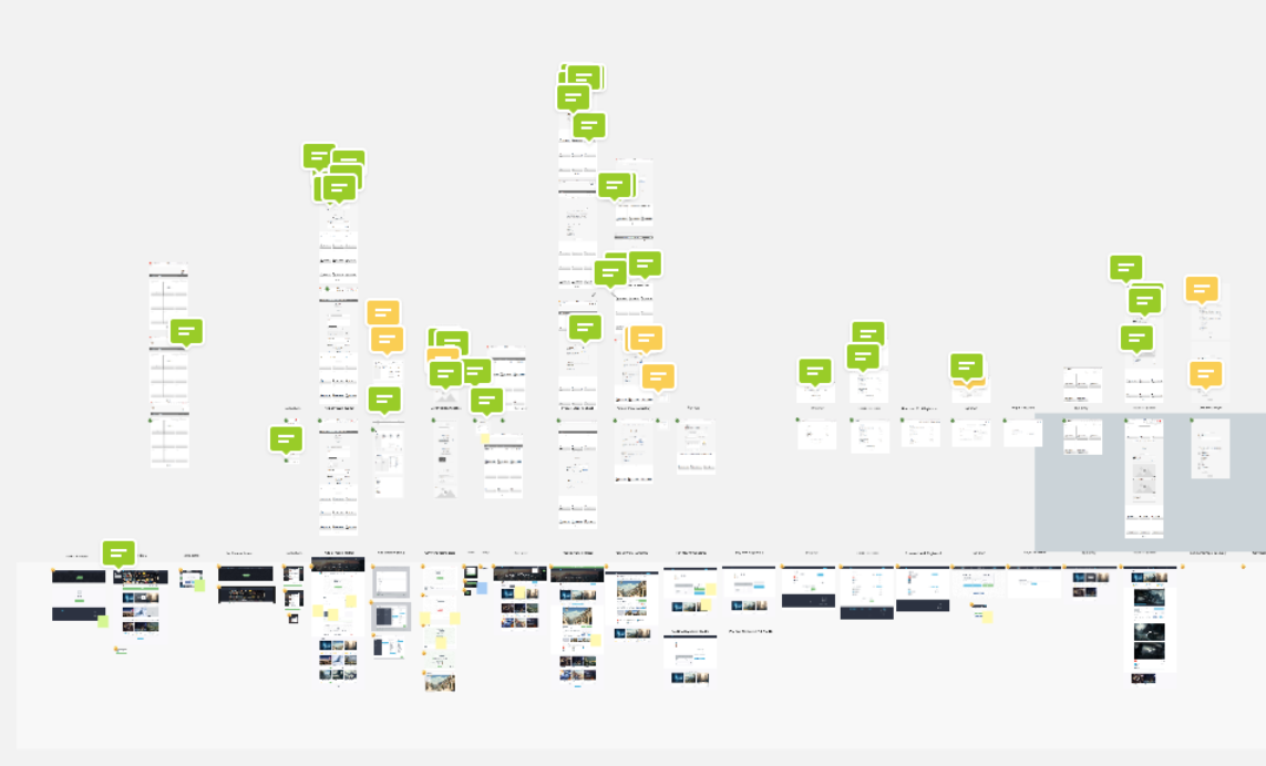
The Cubebrush project board.
Wireframing
After we are done with the theoretical part, it’s time to move on to the actual production. The first stage of production is typically creating the wireframes. It’s important to document every single detail, depict the navigation paths, and components. At this stage, no real content is paid much attention to, as this is where we construct the skeleton of the responsive website.
The first testing comes into play at this stage, as the functionality of the redesigned version has to be representative of the full potential. Collecting feedback and setting the stage for future iterations is what we concentrate on with the initial UX implementation.
A lot of modern frameworks have responsiveness, however, in order to maintain full control over the development process and features, also in order to keep the code’s consistency, we use multiple tools and technologies with the same idea – implement the design to the best of both worlds.
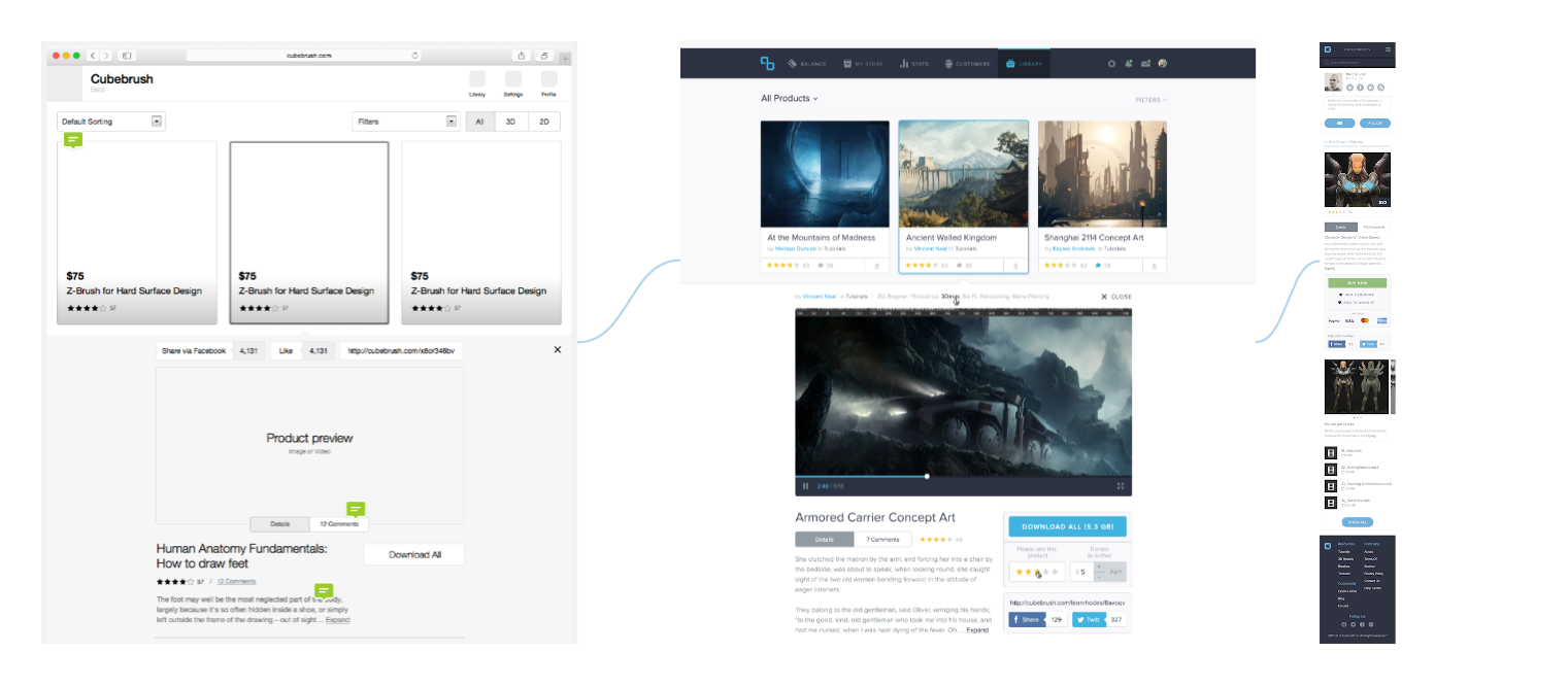
Cubebrush product preview pages
Important things that we abide by at the wireframing stage:
-
Hogging the blanket
Most likely, different members of the team, as well as the product owner and stakeholders might have a different perspective on which features should be leveraged in responsive versions of a website. Developing shared understanding of the goals and ways to reach it is a good way to rid the project of the unnecessary hassle. Taking the client’s experience and knowledge, finding the best way to design the business presence, while keeping in mind the front-end implementation and the back-end resources is the ultimate path that has proven itself a number of times.
-
Resolution alternations
The breakpoints of the website’s responsive design have to be defined before a workable prototype is designed. The set of resolutions depends on a variety of factors, mainly the target audience preferences, content specifics, and device popularity anticipation. For example, it was speculated about whether Apple Watch was going to support some sort of a browser application. If it was the case, I believe we could have witnessed some interesting smartwatch-responsive designs.
-
Grid systems conformity
In order to reach the effective and bug-free transition from design to front end, the responsive design has to follow a solid system. The grid is one of the ways to go about it. Mastering the grid helps methodize the design to development succession and reach uniformity.

Arranging Toolbars
Part of the responsive redesign challenge is arranging the UI elements and toolbars in a way that maintains the familiar navigation while being unique and intuitive for new users as well. One of the essential tools used when mapping the UX is user flow analytics. Different devices establish different ways users perceive content. We are capable of adapting to the mobile UI layouts if those are made according to the general recommendations.
At the same time, optimizing mobile UI is still an open issue, so part of the game and the exciting one is experimenting with toolbars and navigation in order to create a delightful experience with familiar signature features, dominating across all the versions.
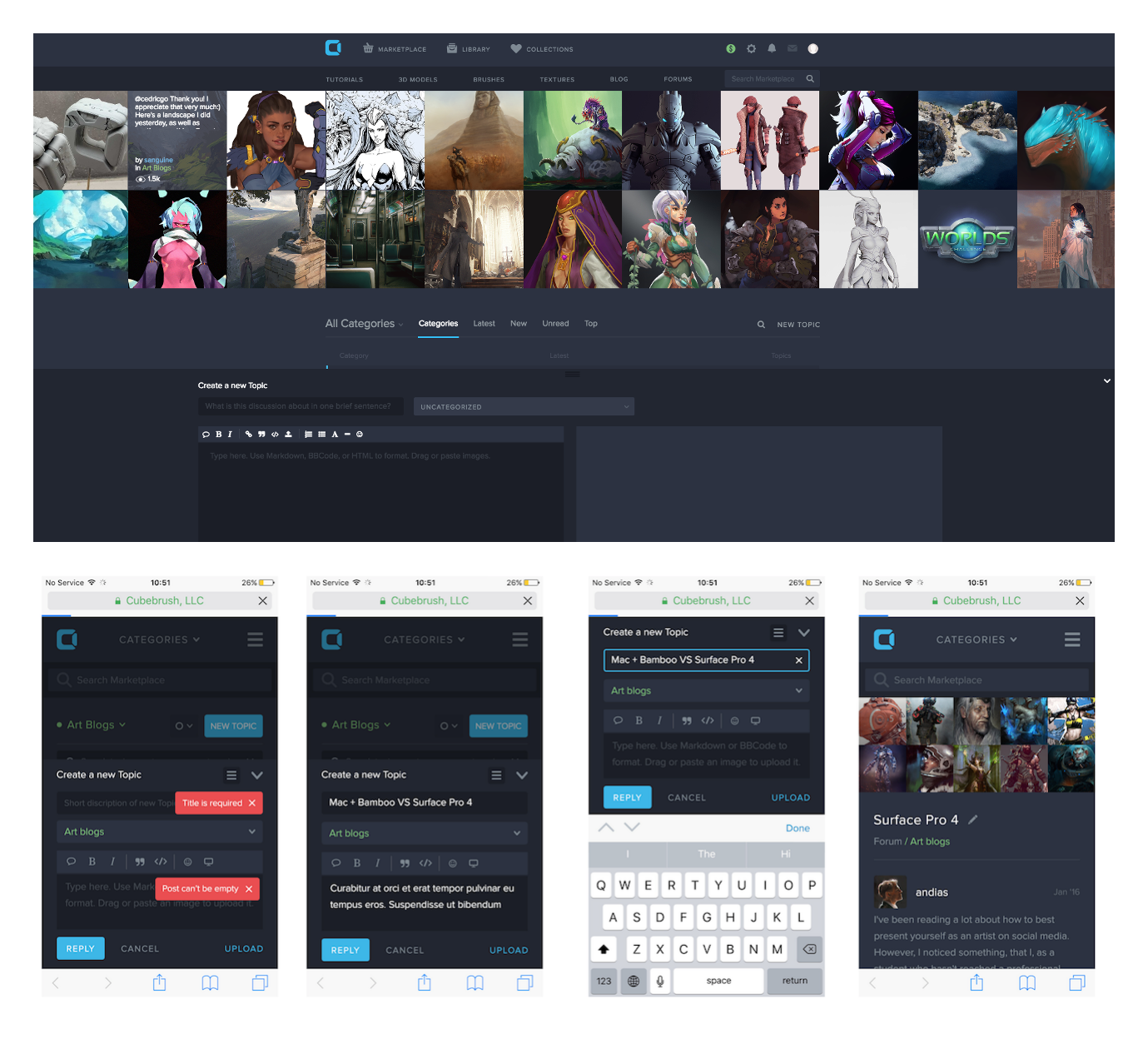
Adding topics on Cubebrush forums
Responsive Navigation
The navigation patterns have to be consistent. This is the general rule that, however, if mistreated can be a harmful matter. Interference of different versions between one another might create faux UX and ruin the whole thing for us.
For example, the notorious hamburger menu button. Originally created as a mobile-only element, it became a pictogram, ingrained into our understanding of the UI elements. Yet, this is where the mobility approach started interfering with the rest of the platforms. A good example is this very Google document I’m currently using to write this article. The UI has a hamburger icon in the top-left corner, that redirects you to the Homepage, where you find another hamburger menu button, that opens a side menu.
This is an example of a mobile interference issue, where you have a ton of space to place navigation elements but instead, the web app emulates the mobile experience and takes to different pages other than offering a more functional use of estate.
But let’s give Google benefit of the doubt. This might be the cue to the future and the providence that we are all yet to come to. Let’s not forget also, that Google’s impact and magnitude are capable of reforming the existing UX. This could easily be their way to cultivate uniformity in all of us.
Displaying Media Content
A great share a website’s appeal, especially in case of an online store, is the imagery and visual content in general. Smaller resolution screens are for a reason reducing the effect that heroic images are set to make. In reality, we get a shot at convenience while ridding ourselves of impressions.
But are we really? Actually, retina display and scalable @2x and @3x images might work better than most desktop computers and smaller laptops. When zoomed in, these images tend to offer a more detailed picture which creates a close-to-real experience. Add to that augmented reality technology integration trends and all of a sudden it seems like having a mobile device displaying HD content as a first source, is not so bizarre anymore.
Multiple website version coding requires just as much effort from a front-end development team, as it does from a designer. The first thing to think of at this stage is the communication.
At Shakuro, we have operated on different remote team variations but never separated a designer from a front-end developer. On top of that, we’ve created a workflow that utilizes design-specific procedures to ensure the best design handoff and implementation we can get.
Among the things to take care of at the implementation stage are the following:
-
Typesetting
In responsive design, the content changes its presentation depending on a bunch of factors, fonts being part of content need to change appropriately. More information on x-height, etc. here.
-
User input methods
This concerns the versions of a website responsive design that utilize different input media. Screen keyboards must not block the content and appear in a way that doesn’t bug a user. It is generally recommended to use as much native UI elements, specific to the platform as possible, but designing your own kit is the way to take care of all the input options.
-
Actual device testing
Emulating the UI and UX design on multiple devices is common practice, but real device testing opens the opportunities to throw some first-hand experience into the mix. This includes not only polishing your own work but also figuring out the native device/platform issues that users might blame your product for. Actual device testing is a way to make workarounds for the operating systems and other third-party issues that you can’t objectively fix.
Conclusion
Scalability is on top of the list of website requirements today. Transforming not only the content for multiple screen sizes but the scalable potential as well is a must-have ability that intersects with the concept of anticipatory design in a way.
There is a reason why apps look different in Android and iOS and even though some features are very uniformal, the distinctive traits are still out there. This creates the ultimate challenge in the responsive UX design. How to leverage the best of each world, while maintaining the signature features.
In it’s finest, responsive design is not a one-size-fits-all matter. The ultimate goal we, as a web design scholars are striving to is delivering a delightful signature user experience, natural for whatever media it is carried on.
You can’t expect to create a responsive version for a huge TV and a smartwatch. You can, however create the two versions of one product to the best of its abilities, consistent and unique in its own way.
