Responsive Web Design
With internet being an essential this days and the growth of affordable mobile phone market, it’s quite clear where we are heading – the mobile UI/UX as our primary network medium.
What was once a competitive advantage for a lot of web design studios, recently became a must. Usually included into a package, responsive design is a super affordable and effective tool for business owners to improve their website usability and overall company image.
That would be peachy if it wasn’t for some ‘buts’.
As Albert Einstein once famously said:
”The devil has put a penalty on all things we enjoy in life.”
We could be enjoying the cross-device design unification unless some problems that might ruin it for you, if not addressed correctly.
5 Web Design Trends | Shakuro
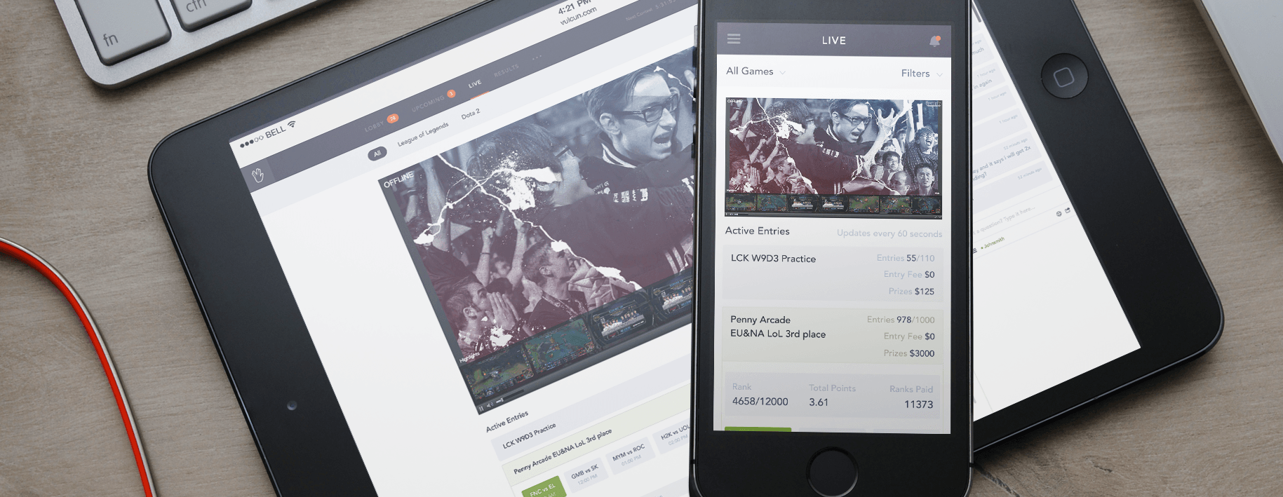
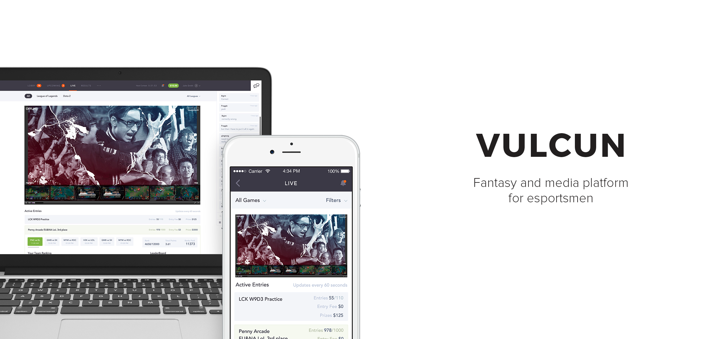
We made Vulcun apps completely responsive and scalable for all types of devices.
One of them is images. According to Eric Portis, most of visual data served online is waste. The industrial movement towards responsive design does not affect content. An HD image on your computer is getting stuffed into your phone as well. Everything displays on anything. Is that not a waste?
Fortunately, now we have a scaling markup attributes like srcset and sizes that allow multiple resolution versions of an image to be directed to devices according to the screen size.
Another polemicized subject has been about best way to develop Web sites that work well across many networked devices. The best strategy suggested by Luke Wroblewski is based around the idea of using responsive design + server side components (RESS), as opposed to plain client-side/server-side approach.
With today’s 15-second-long attention grabbing gap, speed is crucial which means you can’t afford loading overtime and speed issues.
One of the better ways to deal with those issues is utilizing media queries.
As I said, responsive design is more of a must then a bonus now, but it has to be seamless and sharp.
Hero Images on the main page
Hi-resolution full screen dramatic background photos or hero images are very attractive to the eye and grab a user’s attention right away. Thanks to the benefits of bandwidth, the UX won’t suffer from slow load, while data compression takes care of the traffic balance.
5 Web Design Trends | Shakuro
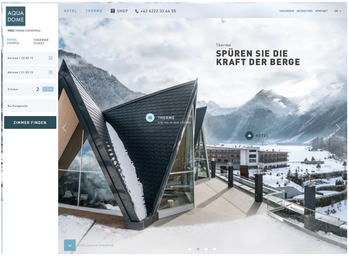
A hero image directly related to the website’s business adds extra credibility to it. Aqua Dome hotel.
An impressive layout is a scroll on top of a hero image followed by card content section. It’s important to remember that HD content is what users expect investing into Ultra HD and 4K devices.
Custom Typography
Newest device screens like Retina and 4K technology bring typography to its golden age. It’s hard to exaggerate the importance of branding for modern business identity and that is where the latest technology and art of typography meet to the great benefit of both.
5 Web Design Trends | Shakuro
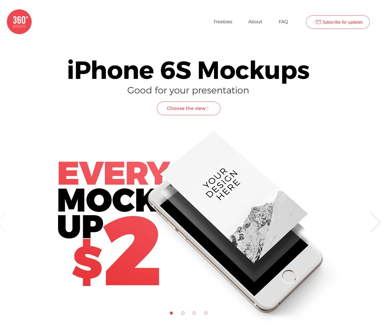
360Mockups use simple, yet distinct typography coupled with a product image.
For a web designer, the ability to incorporate something as unique as, say, a custom font or a better logo inscription can become a serious advantage, while a lettering artist or a typographer gets a chance to showcase their work to an audience huge like never before.
You should no longer be concerned about the challenges of creating a viable CTA that would still be somehow artistic. The visual informative means that is typography, gives you a powerful tool of persuasion.
Things to consider:
- Unique fonts don’t have to be complicated. Clean and simple text is loading better, is minimalistic, and, most importantly, is readable by anyone.
- Bigger typeface size is dramatic and adds clarity.
- ‘Homemade’ style typefaces.
- Using no more than two font families.
- Superimposed text spaces. A good way to make your text prominent is to place it over an image, beyond the limits of the grid. This produces a wholesome impression while highlighting the text itself.
- The two examples of a formal style and a clean style typefaces are Serif and Sans Serif.
Scrolling
To say the least, long scroll for websites is becoming a staple. Whether it’s social media infinite feed influence, or just and intuitive navigation principle, long scrolling is in the trend.
Long scroll websites translate nicely to mobile version which makes the desktop and the mobile user experience pretty much the same.
From a general standpoint scrolling is more exciting than just clicking a menu. It brings the element of surprise because you never know what’s coming next.
5 Web Design Trends | Shakuro
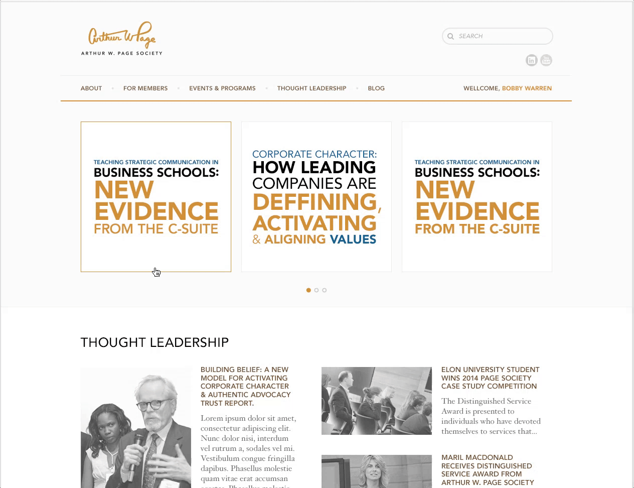
Long scroll for the Arthur W Page Society website.
Things to consider:
- A prompt for a scroll. While scrolling is natural for mobile devices, desktop users perhaps may benefit from a clue that most of the content can be reached as easily.
- Page format can be kept. It is not necessary for a scroll website to be single style, like Facebook or Twitter. At the end of the day you can only see a portion of content on your screen, that is page. Each page can be designed in a different style with different background images, CTAs and even fonts.
- An obvious problem with long scroll is the fact that a user might get disoriented and lose themselves in a website. However, this was solved by social media quite effectively. Sticky menu, or animated jump-to shortcuts when placed properly can help.
- Animation. The mouse pointer-triggered animation has been around for some time. However it does not translate to mobiles well, so scroll-triggered animation might be the best option to make a page visually interesting and responsive.
Website Card Layout
A website that looks like a store window gives clear representation of what it is. Netflix only has movies and shows, so laying out the cards makes the most sense, while giving you a lot of freedom in re-arrangement.
5 Web Design Trends | Shakuro
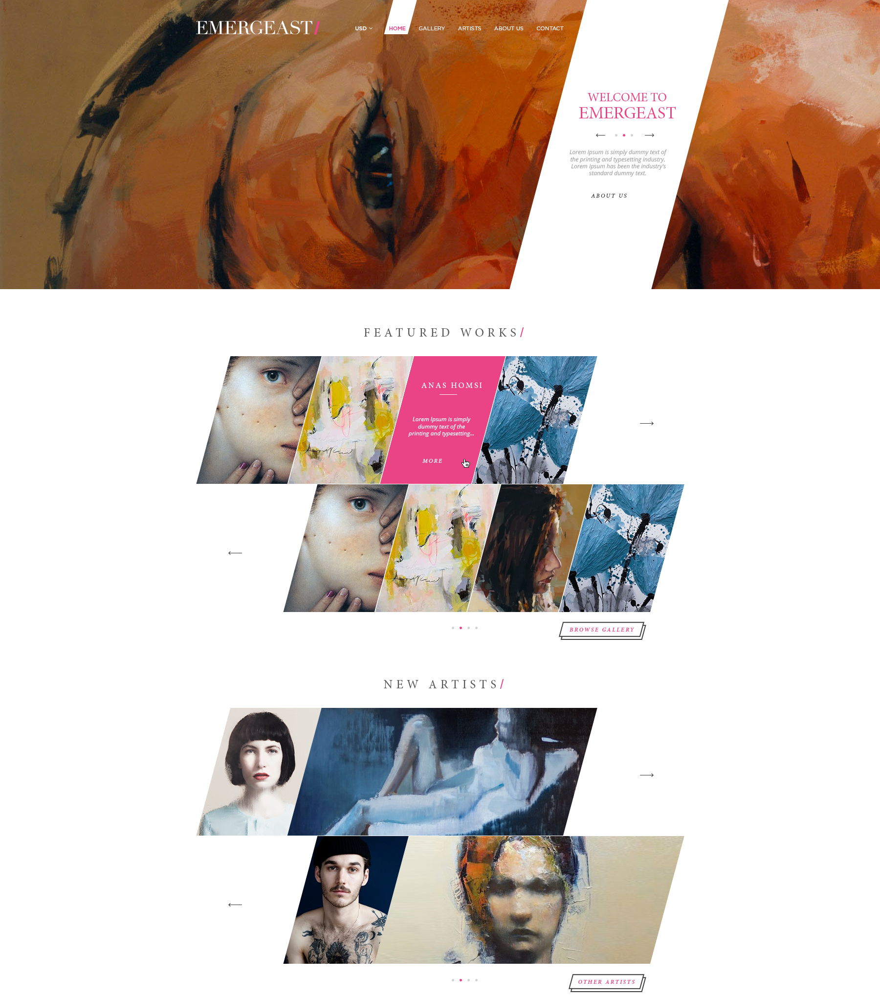
The layout we designed for Emergeast combines mosaic and product preview cards.
