Check out the latest Icon Design Trends for 2024!
Icons are an essential part of any application. With them, we can understand the meaning of a feature without even using it. One glance at the phone icon — and the user understands that they can call someone by pressing the button. However, these tiny pictures should not be neglected. Otherwise, a website or an app will be hard to use because people will waste time on ‘unnecessary’ thinking. How to avoid this?
Since 1981, when the first icon set was created, tendencies have changed, as well as technologies. By following the latest icon design trends, you can enhance UI/UX, create unique looks and make the product easily accessible, even for people with special powers.
What icon types will be popular in the next year? We have gathered the latest tendencies with examples, so you can get some inspiration or adopt the designs for your application.
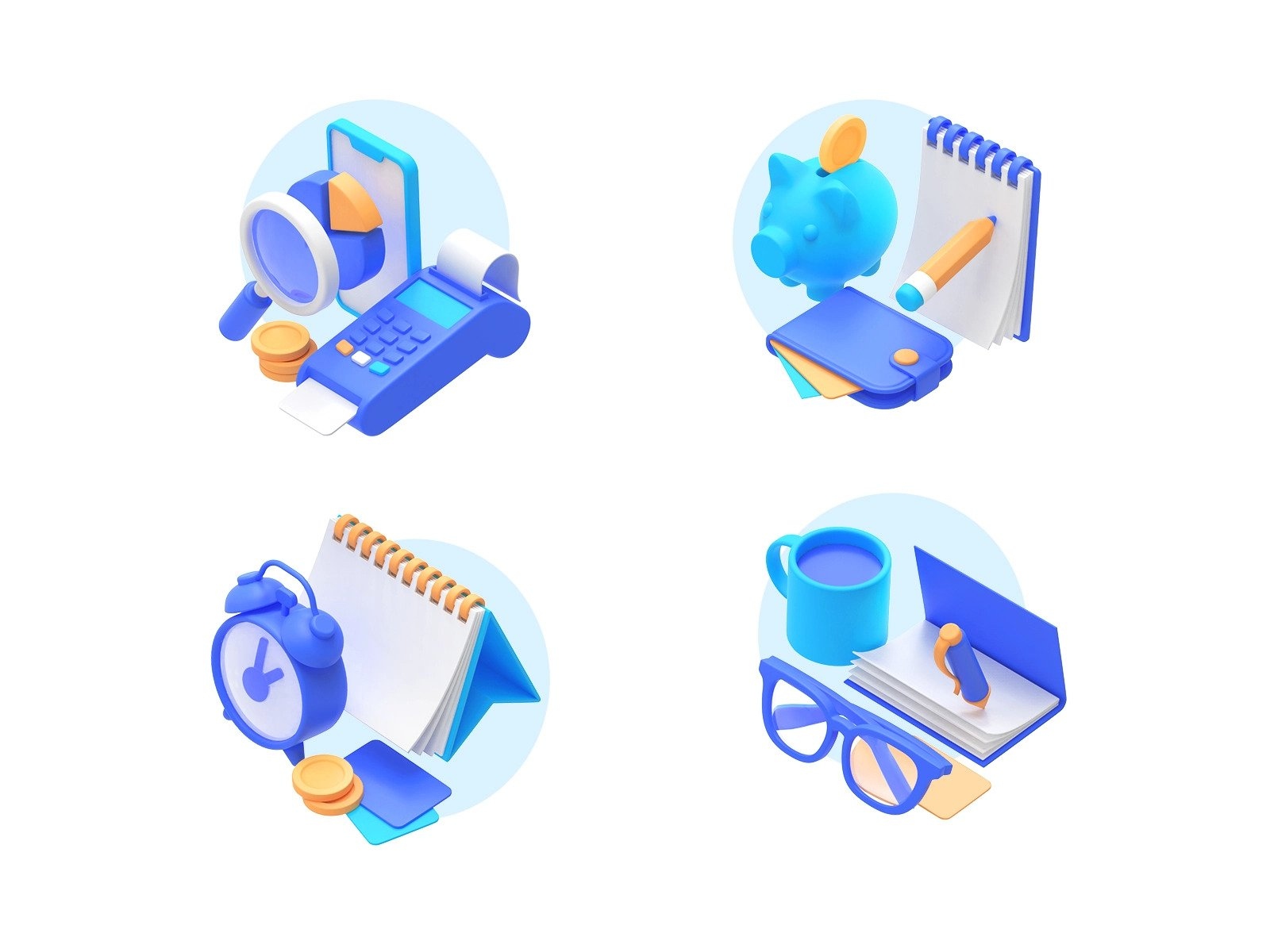
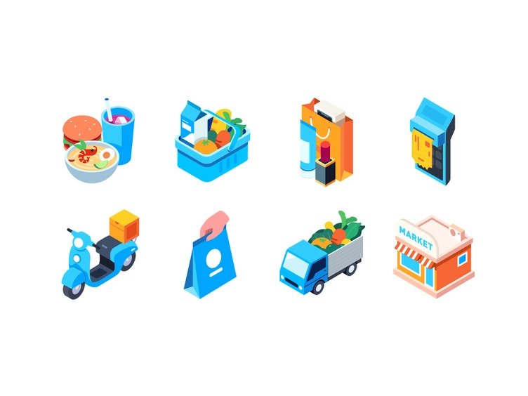
3D icons
Three-dimensional objects give your design additional volume and depth. They have more story-telling power than flat icons, especially if their looks are close to things in real life. Like a metal wrench in the Adjustments button. It’s more illustrative.
3D style is very flexible. Depending on the render, textures, and amount of details, it can fit into different spheres: e-commerce, retail, medicine, etc. Large bubble-like graphics are very popular in web icon design because they provide more ways to express the company’s identity and style.
Three-dimensional icons can be a bit tricky because they are rather heavy in terms of visuals. So it’s better not to overuse this trend. Also, they will draw attention from the content itself and might not mix well with serious intent.
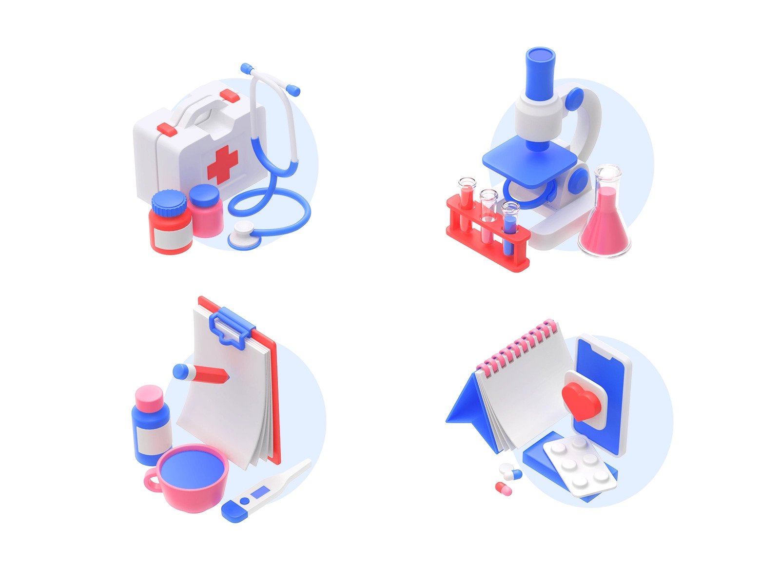
3D Icons for a healthcare service by Shakuro
Hand-drawn icons
Do you need a one-of-a-kind style? Then this icon design trend is worth checking out. You can draw the set yourself, then transfer it to vector. Little imperfections give more spontaneity and individuality. Unfinished touches convey the brand’s message and aesthetics thanks to the drawing. Therefore, people will easily remember your visuals and recognize the application.
Moreover, you can vary the style to your needs: thickness, colors, lines, shapes, etc. By adjusting these aspects, you will find the best combination to represent the product’s individuality.
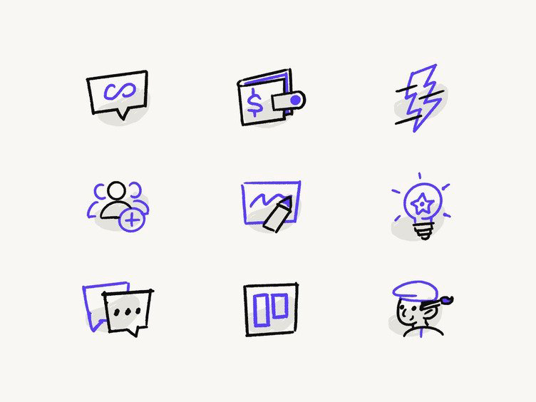
Hand-drawn set by DesignMate
Thick icons
Lines have been an app icon design trend for a while. In 2023, the tendency suggests making the lines thicker. Such graphics are easier to spot and tap. It looks fresh in comparison with the thin line icons that are dominating the applications. Thick icons can be single-colored or filled, depending on your needs.
There are a few tricks you need to remember when applying this trend. First of all, such icons require more space. Next, the designer has to be consistent with the line thickness and size. A few pixels can ruin the whole impression.
Bold and Saucy icon pack by Konstantinas Ladauskas
2D icons with depth
Creating volume and depth in two-dimensional space is rather hard. However, this is a trend for oversized graphics in the app icon design.
You can apply falling shadows and build geometry using harsh shapes to create voluminous depth. By using the right combination, you can turn it into a three-dimensional effect. This feature makes these icons eye-catching but hungry for free space. As a result, they can be used for fairly large areas or together with other elements like a logo.
Isometric icons by Rwds
Simplified icons
This type of icon represents the saying ‘less is more’. Simple elements stripped down of the details are very widespread. You can notice them almost everywhere.
Their key advantage is illustrative power. Simplified icons clearly represent an identifiable thing, so the user doesn’t have to think about the feature’s purpose and recognizes it instantly. This fact improves the experience, making the app easy to grasp. It engages potential clients right from the start. At the same time, you don’t need to make the elements an exact representation of the object or option. With this icons design, you have an opportunity to use any shape while the purpose is still recognizable.
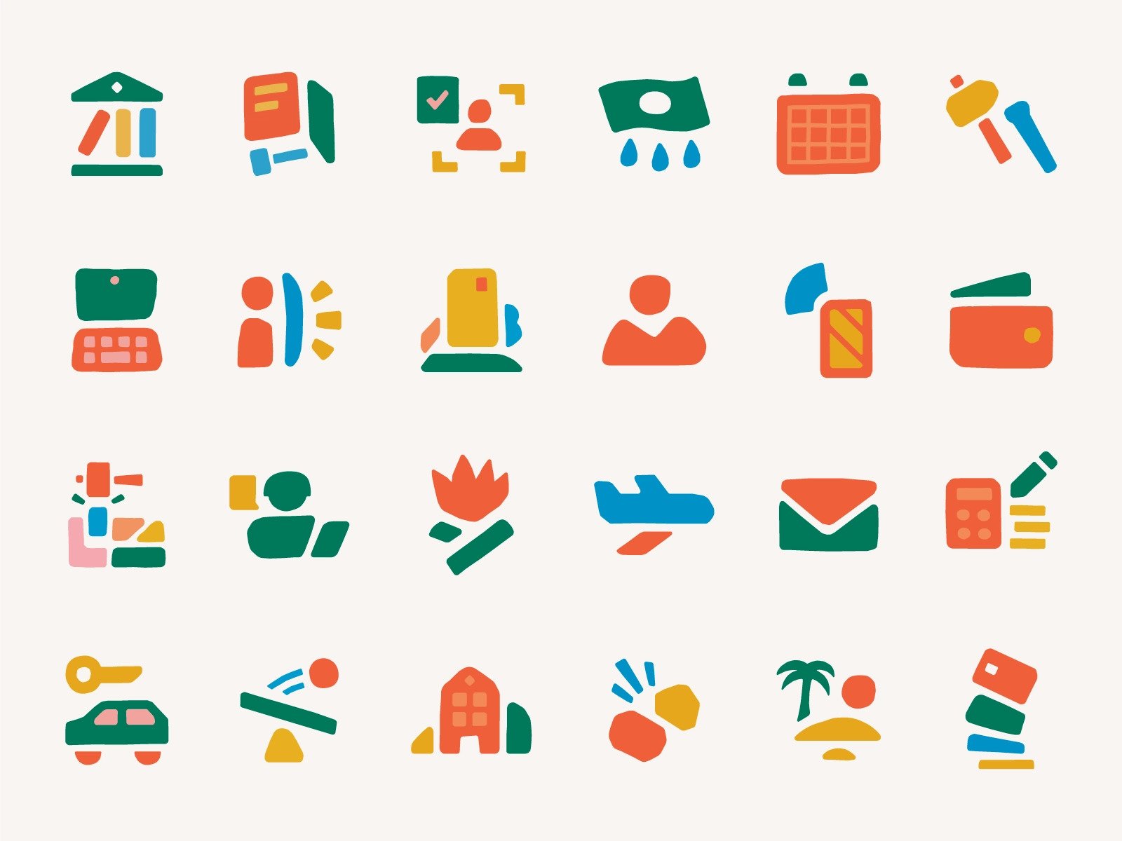
Lithic Icons by Damian Orellana
Icons with color shapes
If you want to use line icons but with a spark of creativity, add color shapes, like a circle or a square. This way, the visual elements are more noticeable in the UI, especially if there are lots of other graphics.
The key to success here is to pick the correct color combination and place it wisely. Usually, filled shapes just float in the background, but you can experiment further. The figure size is also crucial. A large object will confuse the user and pull all the attention away, while a small shape will look like the designer’s mistake. If you are not sure, apply the figure to the full icon size.
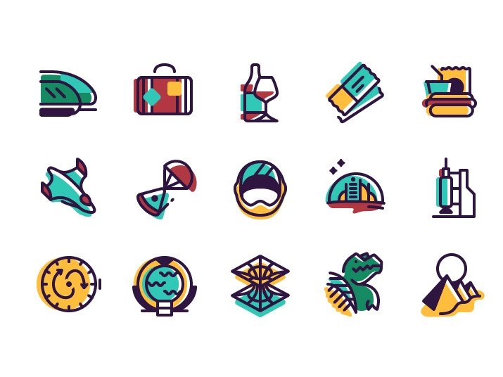
Travel icons by Blake Wilton
As for colors, you can pick one or two primary tones and one or two secondary ones. All of them should correspond to your company’s brand. Moreover, when you design icons for apps, check if all color elements are clearly visible in the interface background. Especially for a target audience with special powers like color blindness. The primary color should take 70-80% of the design, while the secondary ones — 20-30%.
Using this icon trend, you can attract attention to the desired elements and surrounding content on a website or software.
Abstract icons
Don’t know what icon corresponds to the app content? Try using an abstract shape instead of a real object. This style adds a pinch of fantasy to the UI/UX design, making it more captivating.
To create a relevant icon, avoid copying some real-life object by chance. At the same time, the elements should not look too strange. Also, making a shape similar to your logo is not a wise decision as well since it will mess up the visuals. To make the abstract web icon design look more solid, you can pick the brand color palette.
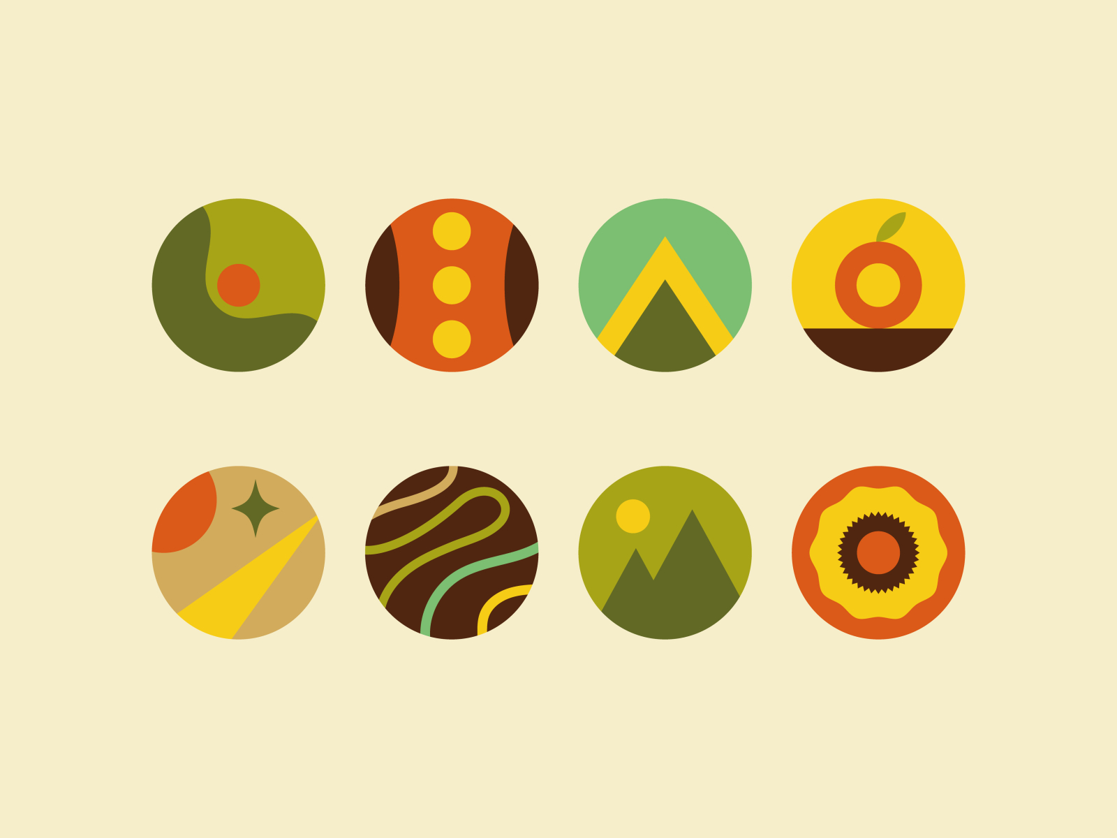
Abstract and circular icons by Léo Alexandre
Flat icons
This style has been extremely trendy for a while. Enterprises like Google added flat elements to all their designs and logos. In comparison with voluminous graphics, flats are simple 2D shapes without any details such as textures or shadows. Bright colors help such icons to pop out of the interface.
The popularity of the flat style is caused by its clarity, so it mixes well with other styles and trends. Moreover, such icons are perfect for small sizes and have high scalability.
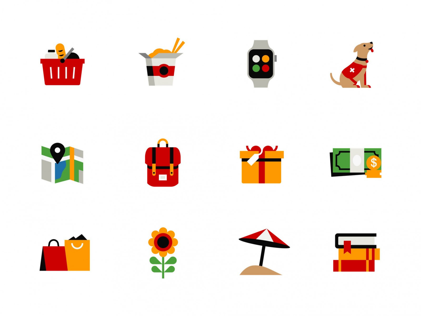
Keybank illustrative Icons by Zach Roszczewski
Icons with muted colors
Have a skincare or food brand? Then go for natural colors and muted tones when designing app icons. They are usually associated with beauty, feminity, calmness, etc. That’s why using these colors in the cosmetics business has become a trend. People just expect wellness and healthcare companies to use muted tones. So by applying soft colors like pale blue, green, brown, and others, you can create a perfect set of icons that will be relevant for years.
Natural colors do not overwhelm the eyes, so that people might stay on the website or in the software longer. They would want to check out the products or services you suggested.
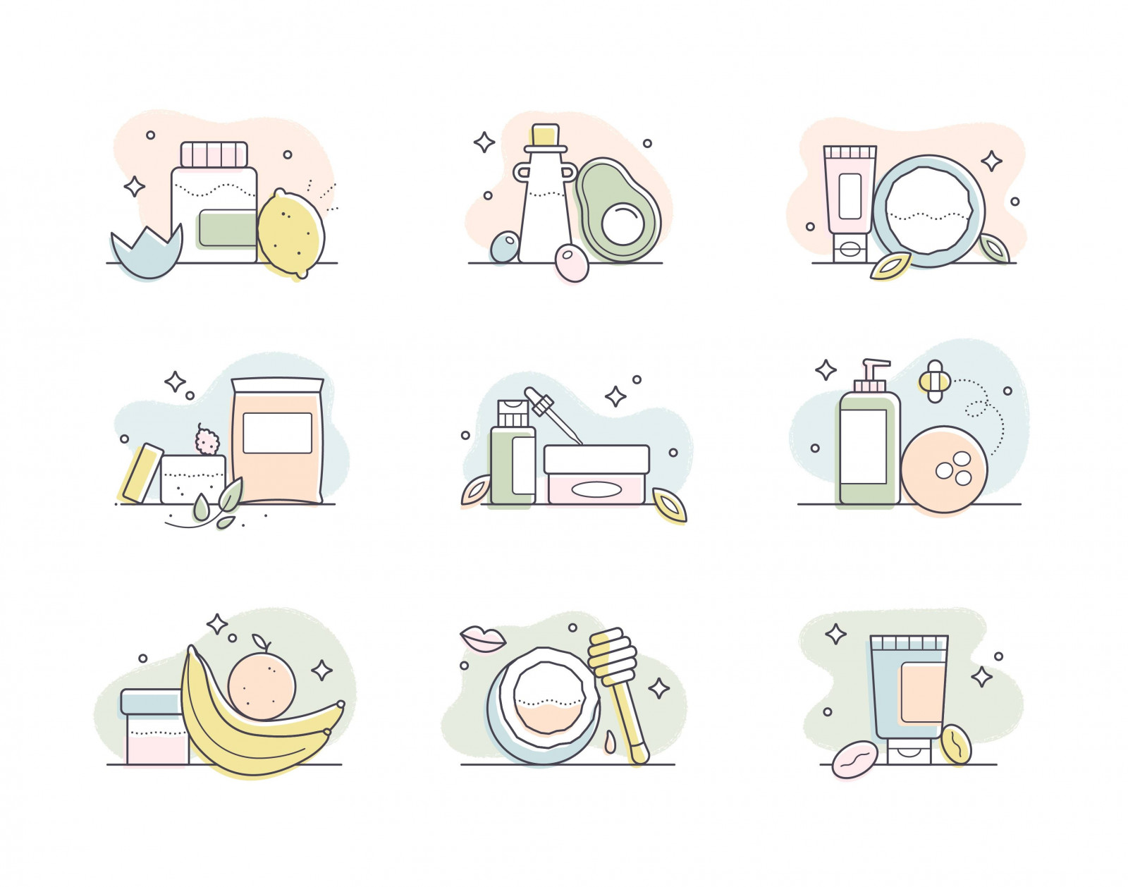
Beauty icons by Jill Mars
Gradient icons
The gradient has conquered the website and application designs. In 2023, it got into smaller elements as well. There are various forms of this style, for example, full gradient backgrounds for white icons or gradient lines on plain color.
One of its advantages is limitless creativity: there are millions of ways to combine colors and gradient forms. You can reflect different qualities and traits of your business. This feature helps the project to stand out among the others, even if they have a somewhat similar style. As a result, you will make an impact on potential customers. This icon design trend is vital for startups and small businesses since their brands need as much attention as possible.
Enterprises like Adobe and Instagram have already jumped into this trend and changed some of their icons. For instance, Adobe Creative Cloud now has a gradient icon.
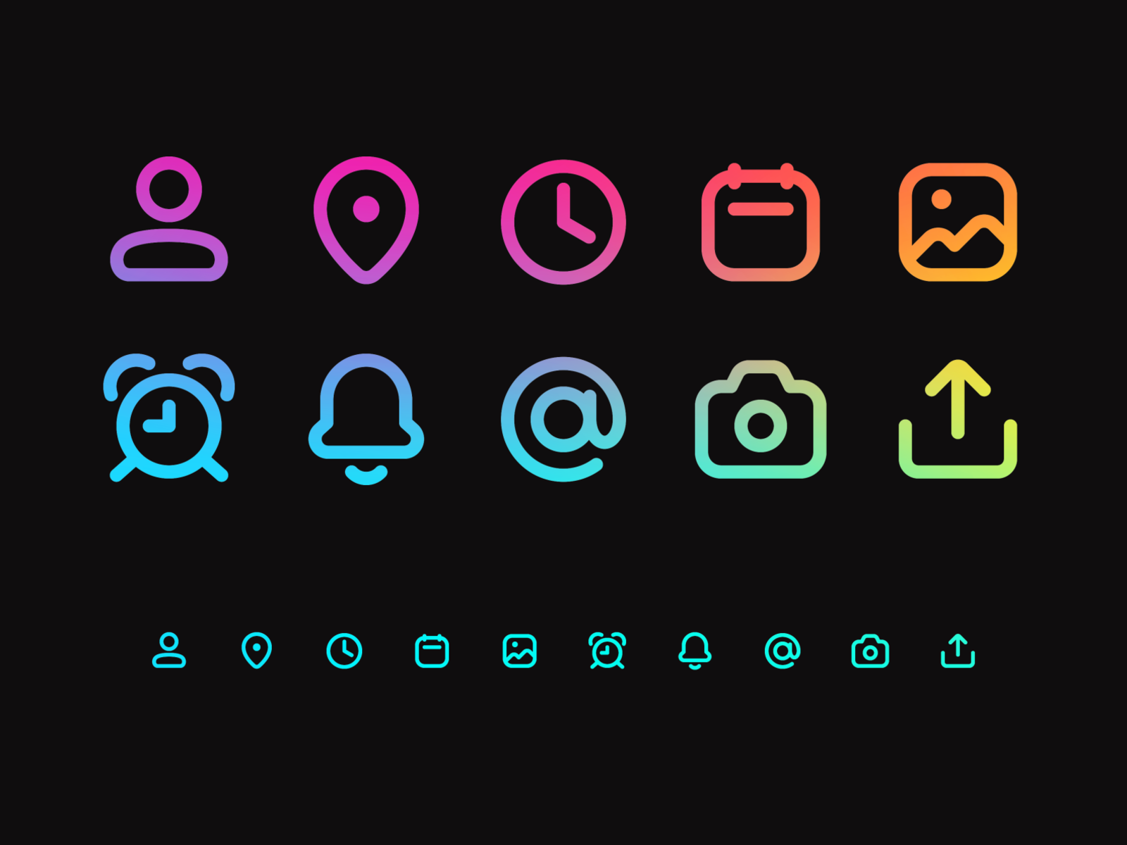
Gradient line icons by Jamie Fang
Tips to design cool icons for apps using trends
When applying the latest tendencies to real cases, don’t forget to follow the common rules of design:
- Build the composition according to the grid and geometry;
- Leave enough white space;
- Use colors corresponding to the brand and company;
- Start with designing the smallest size, then scale up;
- Avoid decorating icons too much;
- Test out several design variants;
Turn icon design trends into the advantage
Using the latest crazes, you can create a well-thought-out UI that provides a perfect user experience. Icons are an essential part of it that helps the viewers navigate around the app. However, rushing for all trends at once is not a wise idea. Pick the tendencies that suit your business, future goals, and target audience, then implement them one by one. Also, testing out the modified designs is crucial.
Do you want to create a professionally-looking icon set for your project? Contact us to get pro-level concepts that will enhance the app design.
