What I saw there blew my mind. I felt like got into a spaceship. All the displays with weird pipelines and digits beaming all over the place. The incredibly low amount of legible information intensified the feeling of intimidation before those massive UIs and added a notable sense of importance to whatever they were producing. Later, I found out I was in the washing-up liquid production block. But holy shit, it looked far more significant. The point of this long introduction being,
The user interfaces that I saw in that Henkel washing-up liquid production unit, were functional as hell but aesthetically presented a cognitive threat and a mental block to my attempts to understand them.
There is a reason why professionals UIs are traditionally not very attractive. The root of purpose-driven user interfaces lies in the origins of functional production which is engineering, as opposed to art that comes from the sensual aspect of human nature. Even though we tend to find beauty everywhere we want, it just has to take a little time and soul-searching, there are general principles of fashion in digital sphere that purely functional UIs don’t seem to be too fond of.
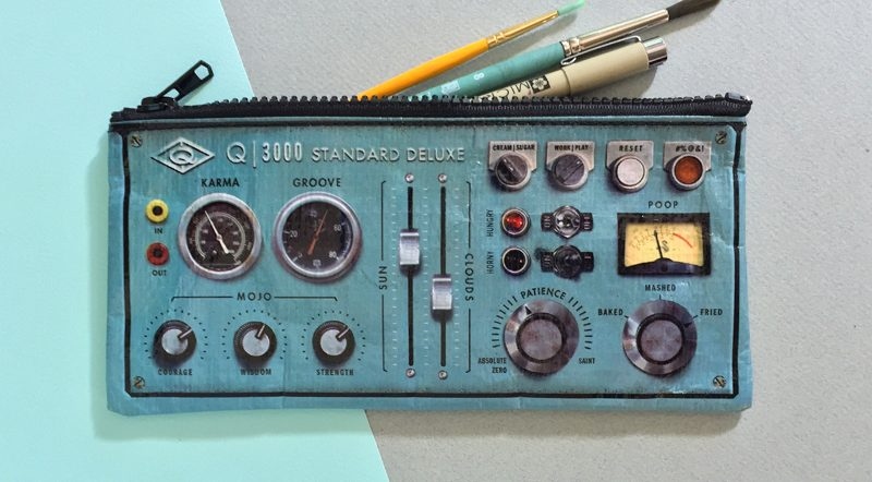
Image credit: RAD tools
Beauty is subjective. Aesthetics is often intended to compensate for something or appeal to the sensual aspect of perception. A rational approach to production doesn’t really tolerate any of those things and that’s why the utilitarian design or the lack of one is a habitual attribute of any important functional UI.
The recreational use of functional interface design principles, however, allows us to tap into the realm of professional UIs and experiment with a hybridization of beauty and functional restrain.
Where there’s no design, there still is some design
Whenever we think looks don’t matter, we are fibbing a little, as aesthetics is always exuding from everything we’ve ever made. From the shape of a razor to the lines of code, we know pretty from ugly and unwillingly gravitate towards the more beautiful thing. Ergonomics has a lot to do with this desire, as it’s natural for us to enjoy useful things. Our enjoyment, then, makes us perceive those things as our “near and dear”, thus making them beautiful in our mind. Fair to say this affects productivity.
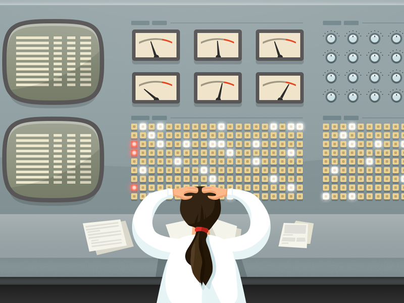
Image credit: Maciej Serafinowicz
Aesthetics for the sake of beauty comes to disrupt this paradigm. The problem is it can’t be formalized and assembled into a somewhat digestible set of requirements. Does this mean designers are free to roam when dealing with a professional interface or it’s better not to involve any designers at all and let the functionality shape some design, and then hope it will make its way into our soul. If so, do we allow people to intentionally ignore the effect beauty produces on people and the impact it has on the product?
Can people operating professional UIs benefit from a better UX by being more productive and appreciative of the tools they are given?
Let’s see.
Why beauty matters
The cool thing about beauty and aesthetics is it’s subjective. In order to tell a pretty thing from a-not-so-pretty, you need to see and feel it, that’s true. But if we are talking about a bridge between functionality and appeal, there are some things that have to be accomplished. Among those are:
- Consistency. Like I was intimidated by the soap production UIs, we tend to be hostile to the unfamiliar substance. One of the goals of design and UX design, in particular, is to create intuitive experiences through consistent and familiar visuals. Our appreciation of things we know is a natural mechanism of navigation through life.
Now imagine how unwholesome the experience would be if it was built by a team of specialists with different backgrounds and purposes, and not brought to a common standard. It’s better for the entire product that this standard would be calculated and holistic.
- Hierarchy. What every designer has to study and be good at is prioritizing elements according to the significance and purpose. What almost every complicated professional interface can benefit from is the hierarchy. Other than putting burning red colors around elements to pay attention to, there are lots of ways to structure UI parts in a more engaging and beautiful manner.
- Engagement. Everything we touch upon invokes an emotional response in us. Through design, we can influence and channel this response, which is a definite advantage, so why ignore it?
- Validation. In an article about the UX design in the Soviet Union, we drew a parallel between the historical formations of a society and the turns of the visual creativity of the same periods. We leave the imprints of our current state through designing in a certain style. This means aesthetics has more to deal with the cultural aspect of utility than just higher society’s fascination with certain fashion.
Relevance. There is a reason why we tend to like new and innovative things while never really letting go of the past ones. We’ve introduced the vintage style into the contemporary movement while still looking for innovation at an exponential rate. Design can take advantage of both the newest fever and the tradition with a stamp of time on it.
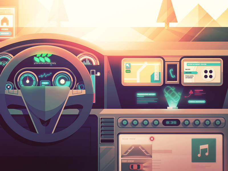
Image credit: Justin Mezzell
Bridging the UI gap between design and functionality
User interfaces have their specific laws and purposes. First off, it’s a visual representation of the actionable organs of a digital (or analog) product. Different products want different outcomes for you and in relation to that, they look a certain way. If we are talking about an action a product has to provoke you to, this means certain positioning of elements in a way that makes this action logical and enticing.
Employee perspective
With most technical interfaces, the task, however, is not marketing-based. Utility and engineering being the head of the corner, technical performance is the purpose. Consequently, most functional UIs are created by the creators of that functionality – the programmers, developers, and engineers. The developer’s perception of an interface is dictated by their deep and profound knowledge of the product’s architecture and its performance as a part of the mechanism.
The developer knowledge is not available for the conventional UI users, which means it builds up a discrepancy between the functionality intended and the ways to get there.
The more complicated the software or web application, the more business processes it entangles and the more data it covers, the wider the discrepancy and the more dramatic are the problems led by it.
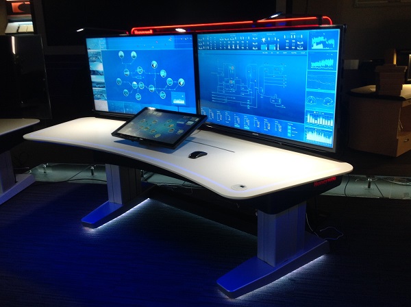
Image credit: Honeywell
If there’s one thing any developer-made design can be attributed to is the imbalance. Once the imbalance kicks into action, users tend to fix it on their terms. They find workarounds which might not affect the performance on a large scale but are crucial in terms of productivity, onboarding, and long distance operation.
If you are present on the market even being a highly specialized solution, chances are there will be competition, which means on the business side of things, you will have to consider the end user appeal.
The aesthetics of your product speaks out for you just as much as the functionality, because if the functionality is no longer unique, guess what steps in? The beauty.
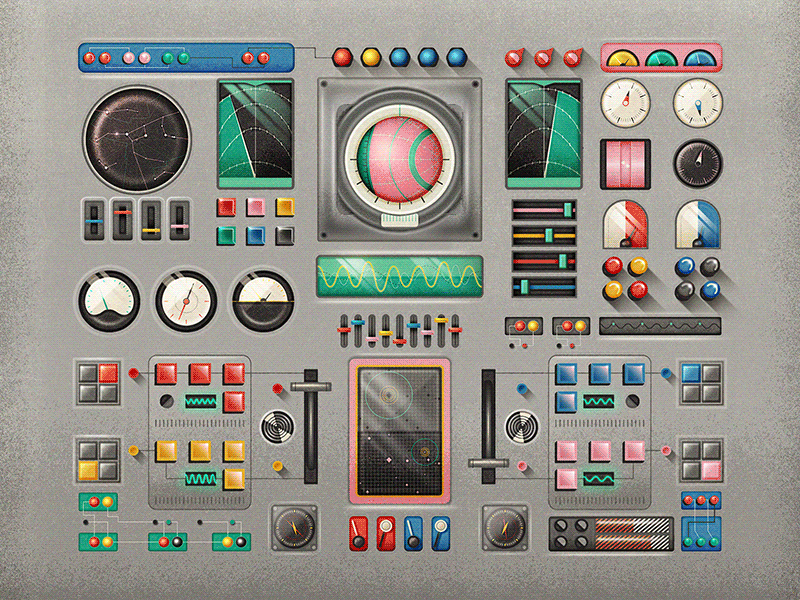
Image credit: Tierra Connor
User perspective
Visually appealing systems are emotionally attractive to us even before we get the first experience with them. More importantly, the appealing interface can help you hold a user longer even though there might be technical deficits. This means professional interfaces have to be beautiful in order to speak better to its users on multiple levels other than just plain utility.
A poorly designed product often resembles a cheap product which invokes neglect, and as a result, does not help build a long-term following and endorsement of that product.
The other side of the coin is the user’s desire to be in control, to make an impact, to be a significant member of the team behind the smooth operation of the system. An over-designed interface can rid them from that feeling and sort of water down the experience they’ve accumulated. If a UI is clear and understandable by an outsider, why even bother learning it?
The sense of exclusiveness has to go along with a fairly complicated interface in order to create a satisfaction from being in control.
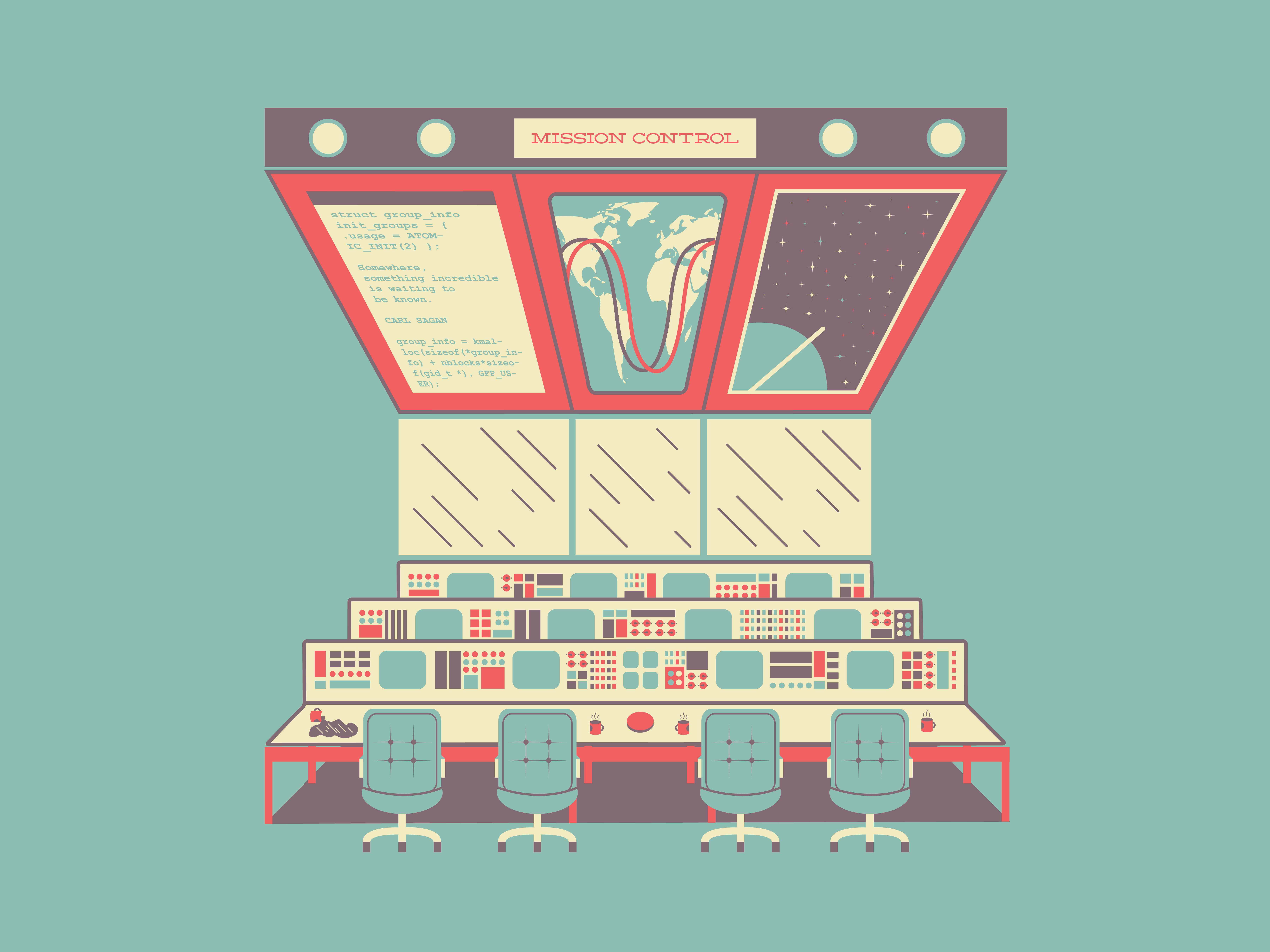
Image credit: Ronald Ferree
With a certain design system in place, you can also tap into the cultural aspect of your industry. A good example would be the Star Wars franchise that for over 30 years has been managing to keep the original spacecraft interfaces and turn it into a cultural phenomenon.
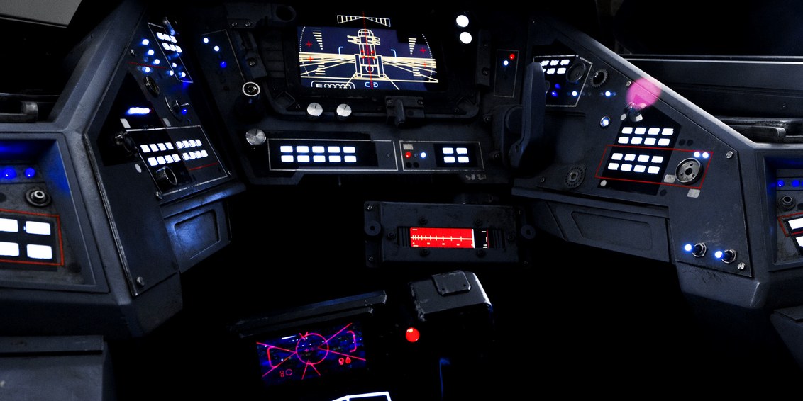
Image credit: Wired
The Wrap-up
The visual aspect of any mechanism including a digital one is a potential leverage point for better user engagement or internal productivity. By employing a strategically selected design paradigm, we can dilute the toughness and inauthenticity of functional and professional interfaces in favor of quality both in the performance and the output.
The face of your business, the indicator of its trustworthiness, and the possible phenomenon it creates on the market is first brought to a user through its visual part – the UI. No problem if it honestly depicts all the strengths and weaknesses of your system, but there are hidden opportunities in something that most tech folks are used to neglecting. And it’s the professional and industrial design.
